Relief Route
A mobile restroom finder that helps older adults instantly navigate to the nearest restroom when every second counts.


OVERVIEW
ROLE
UX/UI Designer
TIMELINE
12 Weeks
TOOLS
FigJam, Figma
SKILLS
User Research, Prototyping, User Testing, Mobile Design
The Problem
How might we help older adults find restrooms quickly so that they can relieve themselves confidently?
The Solution
A simple mobile restroom finder that provides quick navigation to the nearest restrooms that align with user preferences.
Find the nearest restrooms that are ideal to you
A simple map interface presents the 3 closest restrooms for quick decision-making. Since comfort matters, all options are filtered through preferences set during onboarding.


Instant directions to the nearest restroom at the click of a button
For moments when finding a restroom can't wait, the "Go Now" feature instantly directs to the closest restroom. By eliminating extra steps along the way, it helps users get where they need to go as quickly as possible.
CONTEXT
Where are the public restrooms in Toronto?!
Access to restrooms are essential to public health. Everybody needs to use the toilet, yet Toronto falls short in ample public restrooms available. Residents have long voiced concerns about the lack of accessible public restrooms throughout the city.
To hold or not to hold… But what if you just can't?
While this inconvenience affects many, it can have a particularly significant impact on older adults.
With age, natural changes in the body may make restroom visits feel more frequent or urgent. Older adults may find it more difficult to hold their needs, which can increase the likelihood of urgency, leakage, or other bladder or bowel accidents. Research in geriatrics have shown that older adults have distinct age-related and sensitive needs that can shape their routines and limit their participation in daily life.
What's out there right now?
A comparative analysis of current solutions helped us determine what's working and where the gaps that we could fill in are.

Google Maps
Limited restroom listings
Overloaded with competing map information
Inconsistent restroom data

GoHere
Limited preference filtering
Potentially outdated and inaccurate restroom data

City of Toronto Washroom Map
Sparse restroom network
Limited mobile usability
Lacks filtering based on preferences
Understanding the experiences of older adults in Toronto
We wanted to learn how older adults in Toronto currently locate and access restrooms, which amenities they value, and what factors influence their decision to use or avoid a restroom.
To get a better picture of what it's like for our target users, 8 user interviews were conducted. I facilitated 2 of the 8 interviews, each 30 minutes via Teams. Because our research explores a sensitive topic, I ensured that each participant understood their voluntary involvement and how the data collected would be used and protected.
INSIGHTS
Accidents can happen without warning
5 out of 8 interviewees said they've become more concerned about accidents as they've gotten older. They described accidents as unpredictable events that can trigger panic, embarrassment, and urgency. In these moments, the added challenge of quickly locating a restroom can intensify their stress.
"I just cannot hold myself. It's awful when you have that kind of accident. I feel like I almost cry from not making it."
Using extra mental load for finding a restroom
7 out of 8 interviewees said they rely on memory to keep track of restroom locations along their planned routes. In unfamiliar places, they described feeling increasingly anxious, particularly in urgent times. While tools like Google Maps or asking nearby people can help, they felt that these methods are often too slow or unreliable when there's no time to waste.
"You kind of learn where restrooms are but it can mean that you're going out of your way."
Not every restroom feels usable
All 8 interviewees described encountering real-time barriers that influenced whether they would use a restroom. Factors such as cleanliness, safety, and the availability of supplies led them to avoid available options. They also expressed a strong preference for restrooms in familiar locations, such as Tim Hortons or shopping malls, over public city restrooms.
"It kind of sucks because there's an area where restrooms do have hours, but it's closed on weekends, so then you have to go to another area."
PERSONA
Based on our findings, we created two target users.

GOALS
Maintain a professional, timely manner at work
Avoid embarrassing accidents during commute
Travel confidently without worrying about restroom access
FRUSTRATIONS
Needs restrooms multiple times during commute
Health concerns about "holding it"
Sparse restroom availability at transit stations

GOALS
Explore the city comfortably
Find restrooms quickly in unfamiliar areas
Feel comfortable and safe while using a restroom
FRUSTRATIONS
Finds restrooms closed
Filthy and unsafe restrooms
Needs permission to access restrooms
IDEATE
I developed the task flow to balance preference-based search with efficient navigation, while also making sure users can quickly access critical information during emergencies.

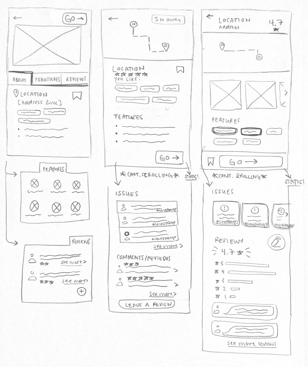
Using the task flow, we sketched potential screens, exploring different design approaches. I then translated key ideas from these sketches into wireframes, using the flow and insights from post-sketching discussions to inform my design decisions.




↓


REFINE
To evaluate whether our design choices aligned with the needs of our target users, we conducted 8 user tests before the final iteration. I facilitated 2 of these sessions and served as the notetaker another 2 tests, helping identify usability issues.
Simplified Turned Too Simple
The sorting and organization of restrooms was confusing. Users were confused about the difference between icons on the map while one user was unsure of what the toggle on the map was for. Additionally, the carousel of restroom options was unclear, where users relied on the search bar to look up restrooms nearby instead of using the map or the list.

Initial Wireframe

New Iteration
"PANIC" Button Caused Panic
Instead of guiding users when they're panicking, the panic button created stress and anxiety. Many users felt scared to press the button because it felt intense. Users also felt uncertain on what would happen if they did press the button.

Initial Wireframe

New Iteration
User Apathy Towards Contributions
Users expressed feeling reluctant to leave a review. One user felt that there were no clear prompts to guide the review process. Most found the icons intuitive but highlighted ones that felt misleading, including the flag, where users thought it signified saving a restroom rather than reporting an issue.

Initial Wireframe

New Iteration
FINAL PROTOTYPE
Relief Route keeps a simple interface with readable text and visual cues to make it accessible for the target audience.


